• How to Use Focus Modes to Take Back Control of Your Attention

    Your iPhone (and Mac) doesn’t know what you’re doing so it interrupts you whether you like it or not. Focus Modes are how you take back control

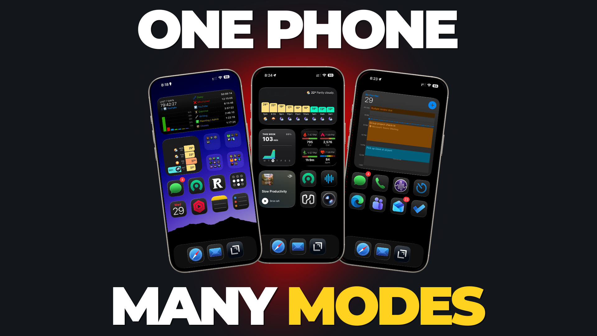
    Header image showing three different iPhone home screens with the text "One Phone Many Modes"

    Your iPhone doesn’t know if you’re at work, out for a special dinner with your spouse, or on the treadmill at the gym.

    So it interrupts you the same way no matter what you’re doing.

    The good news is that it’s easy to stop that from happening.

    Focus Modes let you create different profiles for different parts of your life. When you’re at work, you see some notifications but not others. When you’re deep into an important project, you can silence everything that isn’t absolutely critical.

    You can even have different lock screens and home screens for different parts of your life, so what you see on screen matches what you’re actually doing.

    And they sync. Activating a Focus Mode on your iPhone can also turn it on for your Mac, your Watch, and your iPad.

    Here’s how to set them up.

    Setting Up a New Focus Mode

    Open the Settings app and scroll down until you see the Focus setting. Tapping it brings up all your current Focus Modes.
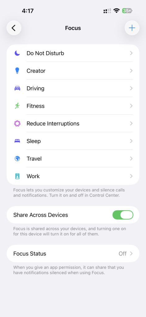
    Screenshot showing a list of Focus Modes in the iPhone settings.

    Note: If you’ve never set one up, you’ll probably only see a couple of defaults here.

    You can have up to 10. As long as you’re under that limit, you’ll see a plus button in the top right corner. That’s how you add new ones.

    There are two settings at the bottom of this screen worth pointing out.

    1. Share Across Devices is the one that syncs everything. Turn it on and a Focus Mode you set up on your phone shows up on your Mac, iPad, and Watch. When this option is on, activating a Focus Mode in one place activates it on all your devices signed into the same Apple ID.

    2. Focus Status controls whether other people are told you have notifications silenced. The most obvious place this shows up is Messages. When someone sends you a message while you’re in a Focus Mode, they’ll see a note on their side saying your notifications are silenced so they know not to expect an immediate reply.

    Creating a New Focus Mode

    Tap the plus button and you’ll get a few preconfigured options. If one of them fits what you’re after, great. Otherwise, Custom lets you build one from scratch.
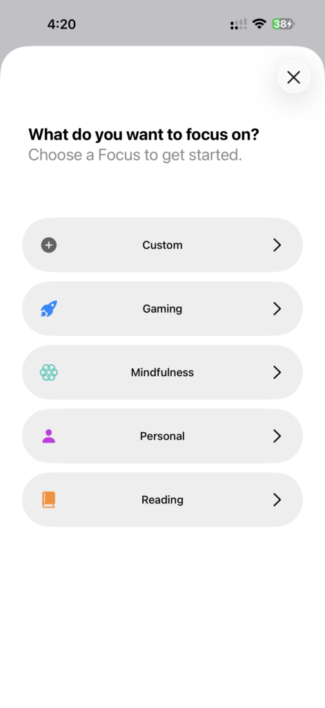
    Screenshot showing create new Focus Mode screen on iPhone with a list of default options

    Give it a name, pick an icon from the list, and choose a color.
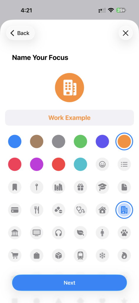
    Screenshot showing the custom Focus Mode creation screen with some sample data filled in for the name, icon, and color

    Then you get to the part that actually matters: Customize Focus. This is where you decide what gets through and what doesn’t.

    Deciding Who Gets Through

    The first option is Intelligent Breakthrough and Silencing. That lets your phone decide whether something is important enough to break through the Focus Mode even if you haven’t explicitly allowed it.

    Below that is where you set up silencing, and you can do it for two groups – people and apps.

    Start with people. You can either silence notifications from specific people, or allow notifications from specific people.

    It comes down to how many people are on each side of the line. If you want to silence everybody except one or two people, use the allow option. If you only want to silence a handful of people and let everything else through, use the silence option.
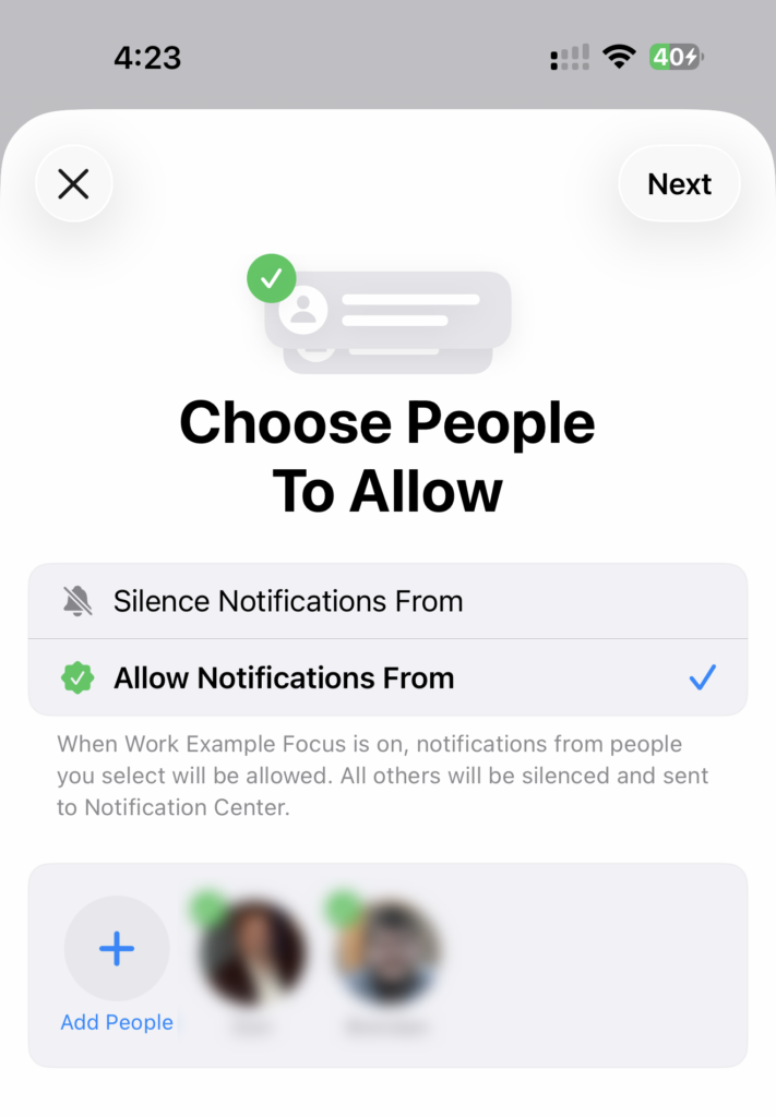
    Screenshot showing the "Choose People to Allow" setup screen for Focus Modes on the iPhone

    Pick whichever one means less tapping, then tap Add People and choose from your contacts.

    Once you’ve done that, you get a separate set of options for phone calls. You can allow calls from everyone, only from the same people you just picked, only from contacts marked as favorites, or only from people in your contacts list.
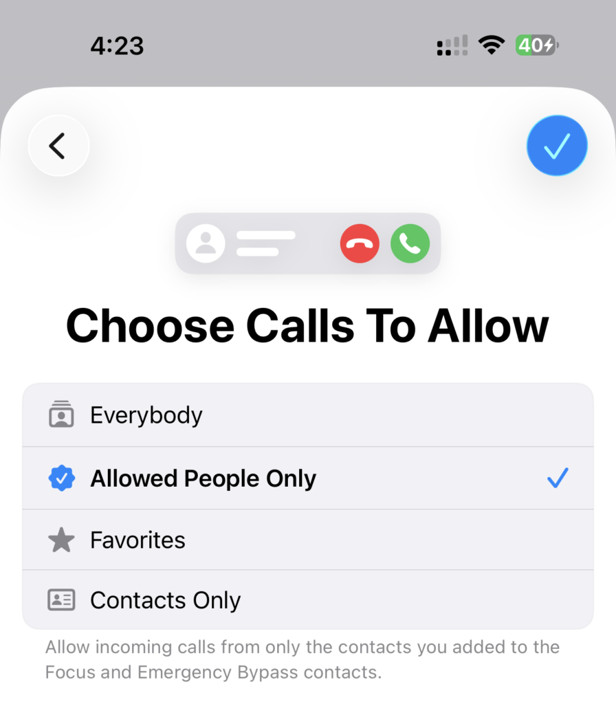
    Screenshot showing the "Choose Calls to Allow" setup page for Focus Modes on the iPhone

    That’s handy if you want to silence messages and app notifications but still want an actual phone call to reach you.

    Deciding Which Apps Get Through

    Apps work the same way. Silence notifications from specific apps or allow them from specific apps.

    If there’s something in the default list you don’t want, just tap it to uncheck it. Tap Add Apps and you get the full list of everything on your phone, with a search bar at the top so you don’t have to scroll through dozens (or maybe hundreds) of apps.
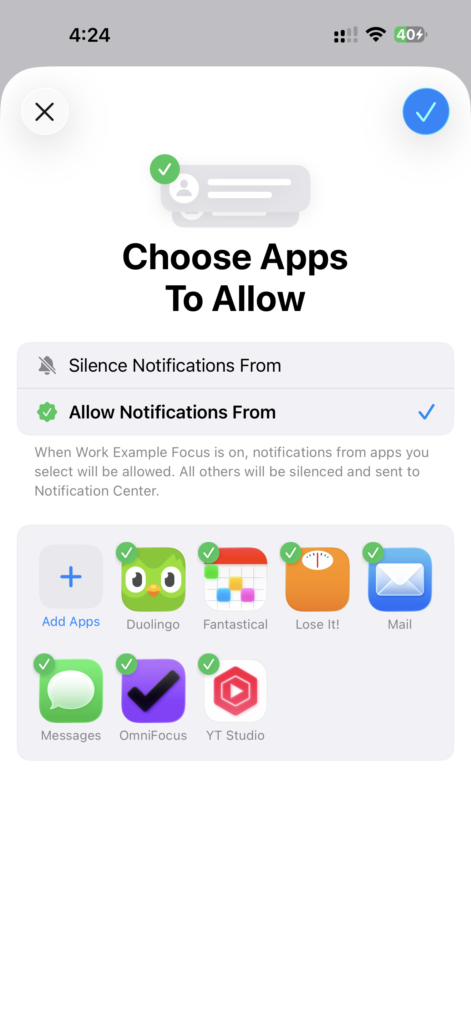
    Screenshot showing the "Choose Apps to Allow" setup screen for Focus Modes on the iPhone

    Pick the ones that make sense for the Focus Mode you’re building. Anything you don’t pick won’t get through.

    Fine-Tuning What You Actually See

    Underneath the people and apps settings, there’s an “Options” setting. Tapping into that gives you a few options that control how silenced notifications behave.
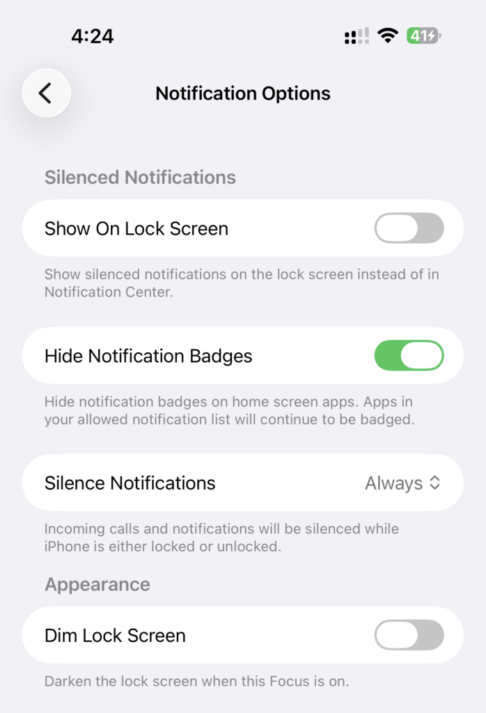
    Screenshot showing the Notification Options for setting up Focus Modes on the iPhone.

    Show on Lock Screen. Silenced notifications can still appear on your lock screen if you want. You won’t get pop-ups or badges while you’re using the phone, but you can still glance at the lock screen and see what came in.

    Hide Notification Badges. This is on by default. Turn it off and you’ll still see those red badges on Messages, Mail, or whatever else, even though the notifications themselves are silenced.

    Silence Notifications. Choose between always or only while the phone is locked.

    Dim Lock Screen. If you have a phone with an always-on display, this dims it so it’s less distracting when the phone is sitting on your desk.

    Automatically Activate Focus Modes

    The whole point here is that you shouldn’t have to remember to switch modes. That’s what the Set a Schedule section is for.

    Smart Activation is off by default. It turns a focus on at relevant times based on things like your location and which apps you’re using. It needs some time to learn what you’re actually doing when that Focus Mode is on, and then it starts activating on its own.

    Personally, I prefer to have a little more control over when a Focus Mode is activated. I don’t like unlocking my phone or Mac or glancing at my Watch and discovering something changed without me deciding it should.

    If you’re on the same page, Add Schedule gives you three triggers that you control.
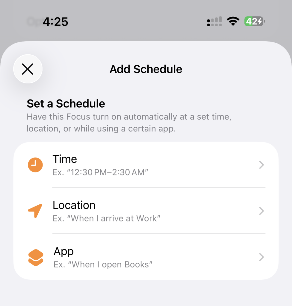
    Screenshot showing the different scheduling options for setting up Focus Modes on the iPhone

    Time. This one is pretty straightforward. For example, if you work 9 to 5 from Monday to Friday, set it to turn on at 9:00 and off at 5:00, and deactivate Saturday and Sunday so it only runs on weekdays.

    Location. If you have your home and work addresses on your contact card, they show up here automatically. If those aren’t what you want to use as a trigger, you can search for any address and the Focus Mode activates as soon as you arrive.

    App. The Focus Mode turns on when you open a particular app. This can be useful if launching a particular app is always a signal you’re changing “modes”. For example, if you have a VPN app you only ever use to connect to your work network, opening it can switch you into your work Focus Mode automatically.

    Focus Filters Are Where It Gets Interesting

    Focus filters are where you get really fine-grained control.

    What shows up here depends on what you have installed, because apps have to support focus filters to appear in the list. A couple of examples are built in and should appear on everyone’s phone though.

    Calendar. You can choose which calendars are visible while the Focus Mode is on. For example, if you don’t want to see personal events during your workday, turn those calendars off here.
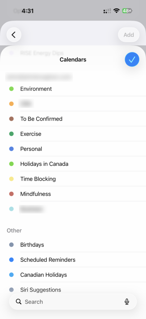
    Screenshot showing a list of calendars in the Calendar Focus Filter settings on the iPhone

    Messages. You can filter by people and it hides every message thread except the ones from the people you’re allowing notifications from.
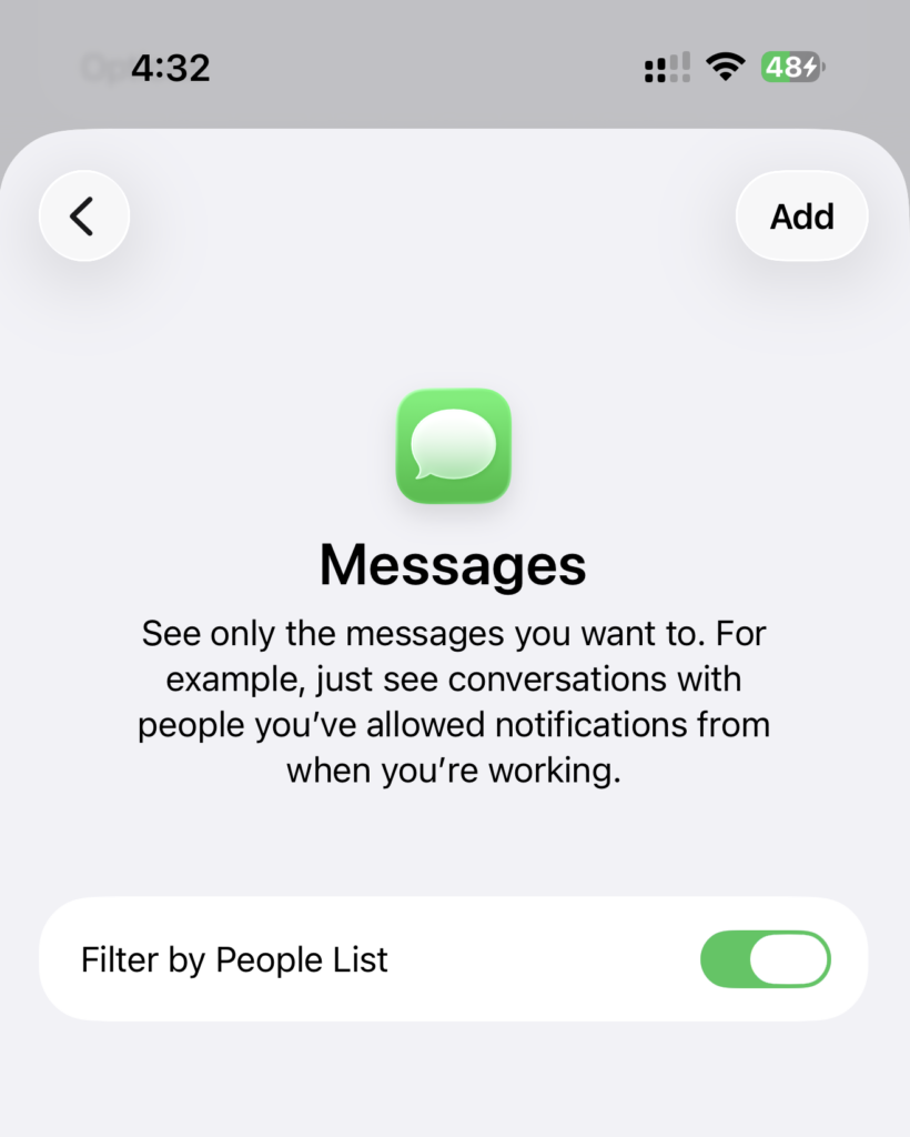
    Screenshot showing the Messages Focus Filter settings on the iPhone

    If you only allow notifications from a few people but don’t turn this on, you’ll still see everything when you open Messages. New threads, unread messages, all of it is still sitting there waiting to pull you off track.

    Turn the filter on and those threads are hidden while the Focus Mode is active. Nothing is deleted, it’s just out of sight until you switch modes.

    Some apps only offer one or two options, others offer a whole range of settings. It’s worth tapping into each app in the list to see what’s available.

    A Real Example: The Personal Focus

    The one I get the most out of is a Personal Focus Mode that runs after work hours.

    I use silence notifications from for this one, because there are only a couple of apps I need to block. Outlook and Teams get silenced after hours. If somebody drops a message in Teams at 9 PM, I don’t need to see it until the next morning.

    Time-sensitive notifications still come through though. If you’ve got something like a reminder or a calendar alert that fires in your “off” hours, those will get past the filter.

    If you’re building a personal Focus Mode, I suggest silencing anything work-related that you genuinely don’t need to see once your day is done.

    Custom Home and Lock Screens

    Under Customize Screens, you can give each Focus Mode its own home screen, lock screen, and Watch face. Different apps, different widgets, different wallpaper. Switch modes and the whole look of your phone and watch change.
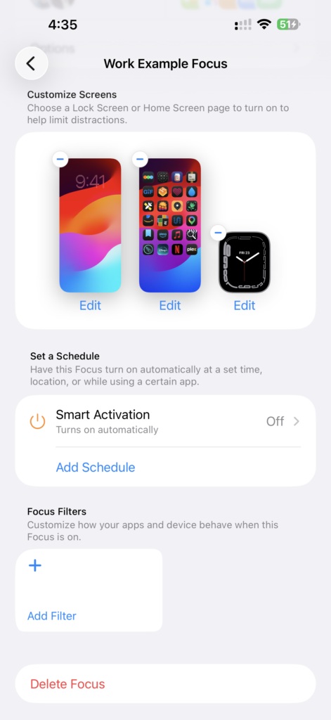
    Screenshot showing the lock screen, home screen, and watch face options in the Focus Mode settings on the iPhone

    The one thing that doesn’t change is the dock. That stays the same no matter which Focus Mode you’re in.

    How It Works on the Mac

    Open System Settings on your Mac and Focus is in the list, same as on the phone.

    With Share Across Devices turned on, every Focus Mode you’ve built shows up here, configured exactly the way you left it. Same people allowed, same apps, same options.

    There are a couple of things to keep in mind though.

    Allowed apps. A lot of the apps you picked on your phone will be iPhone-only. If you want to silence Mac apps too, you need to add them on the Mac itself. They’ll sync back and forth, but only the ones that actually exist on a given device will do anything there.

    Screen customization. The Mac doesn’t offer custom home and lock screens like the iPhone does. You can’t set up multiple desktops or lock screens the way you can on the phone, so the option isn’t available.

    You could work around it with Shortcuts, though. If you build a shortcut that changes your desktop wallpaper, you can trigger it with a Shortcuts automation when a Focus Mode turns on.

    It’s not built into the Focus Modes feature itself on macOS, but this gets you most of the way there.

    Start With One

    Your iPhone comes with a few default Focus Modes for things like driving and Do Not Disturb, and you can build up to 10 in total. Family time, work, exercise, reading – whatever parts of your life deserve their own set of rules.

    But don’t build 10 on day one.

    Start with one. Pick whichever part of your day gets interrupted the most and set up something simple for it. Then add rules as you notice things breaking through that shouldn’t.

    Once you get a feel for how the pieces fit together, setting up the rest will be a lot quicker and easier.

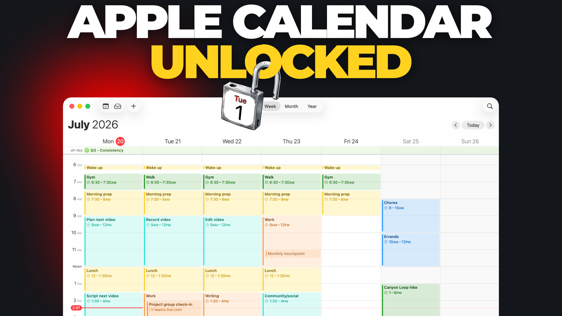
    If you want to see a step-by-step walkthrough of how to set up Focus Modes, I go through the process in this video:
  • How to Get the Most Out of Apple Calendar

    Setting your calendar up this way puts control of your time back in your hands

    Have you ever opened your calendar and realized it’s basically just a list of commitments that other people put there?

    Meetings you didn’t plan…

    Deadlines you didn’t schedule…

    Nothing on it that protects your time for the work that actually matters.

    The calendar isn’t the problem. It’s the setup.

    Most people use Apple Calendar with zero configuration, so it ends up being a passive list of events instead of an active planning tool. Here’s how to set it up so it helps you plan your time instead of just reacting to it.

    The Two-Week View

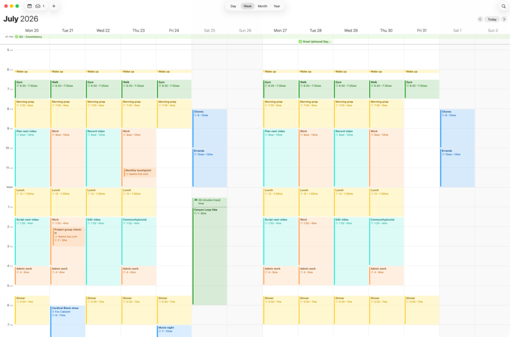
    My primary view is the weekly view but I don’t actually work from a single week at a time. I prefer to see this week and next week at once.

    Screenshot showing a 2 week view in the Apple Calendar app

    Calendar doesn’t give you that option in the regular settings. You can only choose either 5 days or 7 days per week.

    There is a way to get a 2 week view, but it takes a trip into Terminal.

    defaults write com.apple.iCal n\ days\ of\ week 14

    That command updates a hidden preference that controls how many days show up in week view, and sets it to 14 instead of the default 5 or 7. Run it and Calendar will switch to two full weeks at once instead of just one.

    Note: I’ve been told it only works on Apple Silicon-based Macs (M3, M4, etc.) and not Intel-based models. I don’t have an older Mac to test with but if you’re on an Intel-based machine, it may not work for you.

    This change isn’t permanent. If you ever go back into Calendar’s own settings and pick 5 or 7 days again, that setting takes over. To switch back to 2 weeks, just run the Terminal command again.

    A Separate Calendar for Every Part of My Life

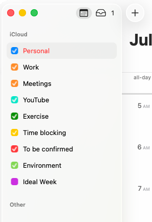
    I don’t dump everything into one calendar. I’ve split mine into different areas of my life, each with its own color, so I can look at a week and get the whole picture at a glance.

    Screenshot showing a list of calendars in the sidebar of the Apple Calendar app

    Most of them are self-explanatory. A few are worth explaining though.

    Time Blocking. This is for routine stuff I do every day – morning prep, meals, etc. None of it is a real commitment. I could technically do any of it whenever I want. But I like seeing that time marked out so I know it’s accounted for.

    Having my lunch break blocked off is particularly helpful for me. I’m prone to just working through the day if I don’t have some kind of visual nudge telling me it’s time to stop and take a break.

    To Be Confirmed. Anything tentative goes here, in its own color, so it stands out. If something’s on my calendar but hasn’t been locked in yet, I want to see that the second I glance at the week. If I see something in red, I know I need to follow it up.

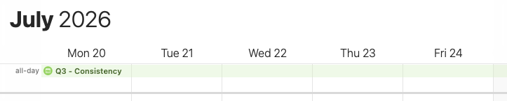
    Environment. I picked this up from a podcast years ago, and I wish I could remember which one to give proper credit. I use it for things that I want to be aware of but aren’t really part of my schedule. Holidays, big-picture items, background events, etc.

    Screenshot showing an example entry on the Environment calendar in Apple Calendar

    For example, I have an entry that highlights my focus for the quarter. For Q3 in 2026, that’s Consistency – publishing on a regular schedule, getting into a regular exercise routine, and so on. It stretches across the whole quarter so I see it every single day, and it helps keep me focused on what matters.

    Setting a Default Calendar

    If you’ve only got one calendar, everything you add goes into it. Once you’ve got several, you need to tell Calendar which one is the default.

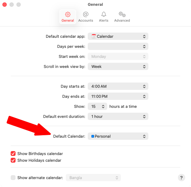
    Screenshot showing the settings window in Apple Calendar with an arrow pointing to the Default Calendar option

    You’ll find this in Settings for Apple Calendar, in the Default Calendar option.

    Week View vs. Month View

    The week view (with the 2 week trick) is where I do my actual planning – daily reviews, weekly reviews, etc.

    Month view serves a different purpose. I use it to see how packed any given day is.

    If I’m doing monthly planning and I need to find time for a project, month view makes it obvious at a glance where the open space is.

    This is where turning off certain calendars can help. To hide a calendar, just uncheck it in the list of calendars in the sidebar.

    I don’t need to see Time Blocking or Environment entries when I’m scanning for open time, I just want to see actual commitments. Looking at it with those entries removed, it only takes a glance to see which day has the most room to work with.

    Two Types of Calendar Entries

    I have two types of entries on my calendar.

    The first is specific-time commitments – a meeting, a concert, an appointment. If you’re not there at the scheduled time, that’s it. There’s no doing it later.

    The second is more of a “work session” than an event. Things like “plan next video” or “work on project X” aren’t fixed appointments. I’m not meeting anyone or doing something that requires me to be there at a specific time. I’m just blocking three hours on a Monday morning to get something done.

    That block is a lot more flexible. If I wake up late or something comes up, it can move. The actual list of what I’m doing during that block lives in my task manager, not on the calendar itself. The calendar just protects the time.

    It also helps surface imbalances. If I look at a week and only see one block of content-creation time, I know I haven’t scheduled enough of it to actually get something made.

    This is one of the benefits of giving each calendar its own color. It’s easy to see if one color has too much or too little time compared to the others.

    Getting More Out of Each Entry

    There’s a lot of options once you start digging into individual entries.

    Location and alerts. Add an address to an entry and Calendar can alert you when it’s time to leave.

    Recurring events. Double-click an entry to open the details, click on the time to expand the scheduling options, and you can set it to repeat daily, weekly, or on whatever schedule makes sense.

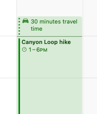
    Travel time. This is the one I use the most. Set a travel time on an entry and Calendar adds that buffer to the front of it as a dotted block without shifting the actual start time of the event.

    Screenshot of a calendar event in Apple Calendar with travel time blocked off before the start time

    I used to pack my calendar so tight that I was constantly scrambling to get to things on time. This fixes that.

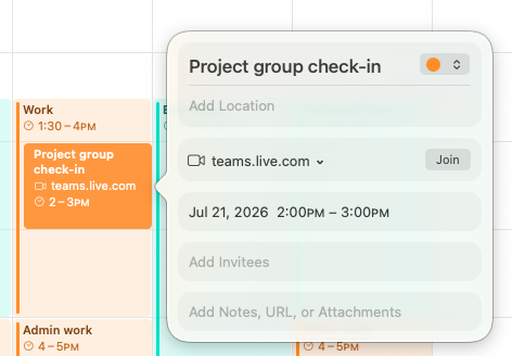
    Meeting links. Paste in details from a video call (Zoom, MS Teams, etc.) and Calendar recognizes it and adds a Join button right on the entry. No digging through email to find the link.

    Screenshot of an event in Apple Calendar with a Join button for a Microsoft Teams meeting

    Connecting Calendar to Reminders and Notes

    This is where Calendar stops being its own island and starts tying into the rest of your system.

    Under Other Calendars, there’s an option to show your scheduled Reminders directly in Calendar. Turn it on and you’ll see the tasks that are due that day right alongside your events.

    I don’t personally work this way. I prefer to keep tasks in my task manager, where that’s the only thing I’m focused on when I’m working through them. But if you want a single view for everything happening in a day, Calendar gives you that option.

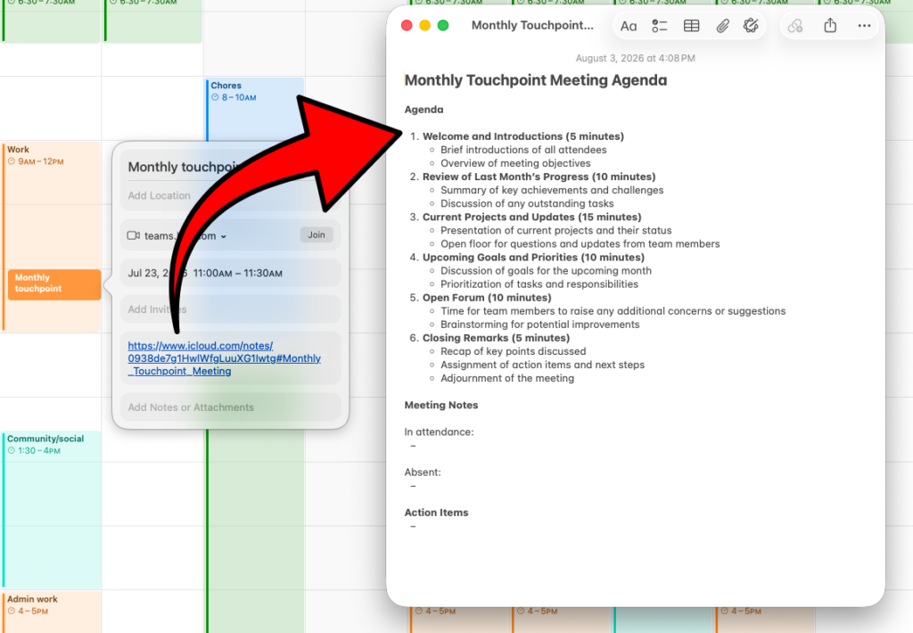
    You can also link a Calendar entry straight to a related note. Paste a note’s link into an event, and clicking it takes you right to that note. This is useful for something like project notes or a recurring meeting where you keep one running note with an agenda and notes from each session.

    Screenshot of a calendar event in Apple Calendar with a link to a note in Apple Notes. The linked note is open beside the calendar entry.

    Unfortunately, you can’t share a note into Calendar from inside Notes itself. There’s no drag-and-drop, no share-sheet option. You have to grab the link and paste it into the Calendar entry manually.

    Once it’s set up, though, everything talks to everything. Your task list feeds into your day through Reminders. Your calendar entries connect out to the notes that back them up. You can genuinely run your whole day from Calendar if you want to.

    The Result

    Put all of this together and your calendar becomes an active tool that helps you run your week – instead of the other way around.

    If you want to see this in action, I go through it step-by-step in this video:

  • Apple Preview – The Built-In App That Replaces Paid Tools on the Mac

    Preview has a lot of features you used to have to pay for. Learn how to replace paid PDF and image editors with this tool that’s included for free on all Macs, iPhones, and iPads.

    If you’ve ever paid for a PDF editor or image app for your Mac, there’s a good chance you spent money you didn’t need to.

    Apple’s Preview app does a lot more than most people realize, and it’s already sitting on every Mac. Most of us only use it to open PDFs or take a quick look at a photo, then close it again without a second thought.

    But it can do all kinds of other things:

    • Sign documents
    • Fill out forms
    • Redact sensitive information
    • Combine PDFs
    • Remove backgrounds from images

    …and a bunch of other things you used to need a paid app for.

    The Markup Toolbar Is Where Everything Lives

    Most of Preview’s useful tools are tucked behind one button on the toolbar – the one that looks like a marker. Click it and a second row of tools appears underneath.

    A screenshot of the markup toolbar in Apple Preview for Mac showing the button to toggle it on and off.

    If you’re not sure what a particular tool does, just hover your mouse pointer over it and Preview will tell you.

    Securely Redact Sensitive Information

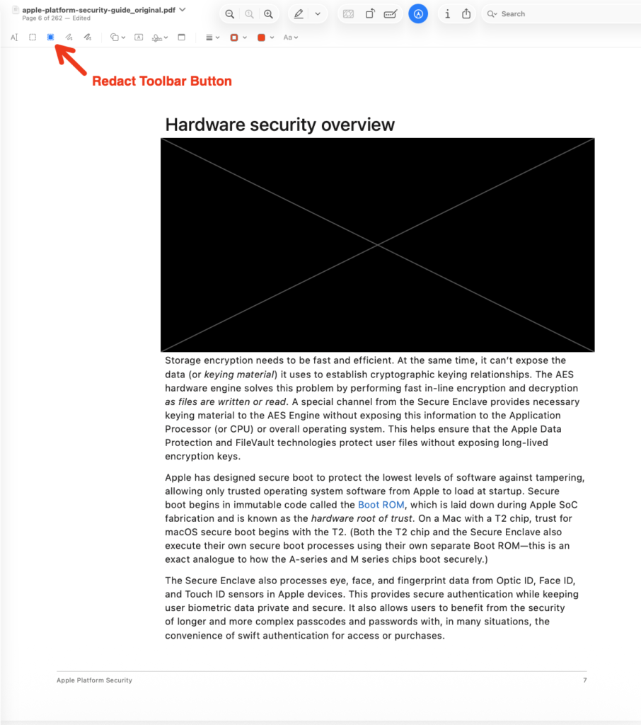
    The redact tool lets you black out anything in a document – a bank account number, an address, anything you don’t want anyone reading the document to see. The important part is that Preview doesn’t just draw a black box on top of the text. It actually removes what’s underneath.

    A screenshot of a PDF document showing the redact button on the toolbar and an example of a redacted paragraph.

    With some tools, the redaction mark is just a graphic sitting over the text, and anyone who knows what they’re doing can pull it off and read what was hidden. With Preview, once you save the redacted document, that information is gone for good.

    To use it, select the redact tool, then drag a box around whatever you want to hide. If you hover over the black box, it’ll still show you what’s underneath – but only until you save. Once you save the file, Preview removes the original text permanently.

    Fill Out Forms Without Typing Everything

    When you’re filling in a PDF form, Preview can pull your details straight from your contacts.

    Assuming you’ve filled out the details in your contact card, of course.

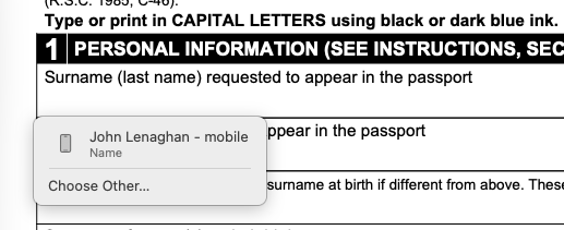
    Click into a form field and you’ll get a popup with your own contact card as the default. Click it and Preview drops in your information – name, address, and so on. If you need to fill the form in for someone else in your contacts, select Choose Other and pick them from the list.

    A screenshot showing the automatic form filling dropdown menu in Preview.

    It’s not always perfect. Sometimes it gets mixed up about what a form field is asking for so you should always double check that everything landed in the right place. But it saves a lot of typing when you’ve got a long form to get through.

    Sign Documents Three Different Ways

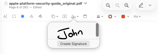
    The signature tool is probably the one I use the most. There are three ways to create a signature and once you’ve made one, Preview saves it so it’s always there when you need it.

    1. Using a trackpad. If you’re on a MacBook or have a separate trackpad, you can sign with your finger. Click to start, then draw your signature on the trackpad – it shows up on screen as you go. While you’re doing this, the trackpad stops acting as your mouse, so when you’re done you just press any key on the keyboard to save it.

    2. Using the camera. Sign a white sheet of paper, hold it up to your Mac’s camera, and Preview will scan the signature off the page.

    3. Using your iPhone or iPad. You can also sign on your phone or tablet with your finger, or in the case of an iPad, with an Apple Pencil if you’ve got one.

    Once a signature is saved, you just click it to drop it into a document, then drag it into position and resize it to fit the signature box.

    A screenshot of the signature tool in Preview with an example signature showing in the dropdown.

    If you want to delete a saved signature, hover over it in the dropdown and click the X. There’s no confirmation and no warning, so just be careful you don’t remove one by accident.

    Combine, Rearrange, and Delete PDF Pages

    Open the sidebar in thumbnail mode and you’ve got a surprising amount of control over the document.

    A screenshot showing a dropdown with the Preview sidebar options showing the Thumbnails option selected.

    You can drag pages into a different order to rearrange them or you can drag pages between two open documents to combine them. If you’ve got two or three separate PDFs you want to merge into one, open them side by side, set the sidebars to thumbnails, and drag pages from one into the other.

    Deleting pages is just as easy – click the thumbnail in the sidebar and either use Edit → Delete or press the delete key.

    Lock Down a PDF With Permissions

    Every so often you’ll open a form that won’t let you sign it electronically. That’s not a Preview limitation – it’s a permission the document’s creator set.

    And you can set the same kind of permissions on your own PDFs.

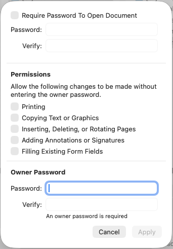
    Click the ‘i’ icon in the toolbar to open the inspector, and the lock icon at the top shows you which permissions are set. To change them, go to File > Export, then click the Permissions button before you save.

    A screenshot of the permissions setting window in the File > Export command in Preview.

    You’ve got two password options. The top one asks for a password before anyone can even open the file. The second – the owner password – controls what people can do once it’s open, like whether they’re allowed to print it or add annotations and signatures.

    Check the permissions you want to allow and leave the ones you don’t unchecked.

    For example, if you wanted to stop someone from printing a document or signing it, you’d check everything else, set an owner password, and export. Anyone who opens it afterward will find those options locked and not available.

    If you need to update a locked document, you can unlock it again by entering the password.

    Shrink a File That’s Too Big to Upload

    Ever tried to upload a PDF somewhere and been told it’s over the size limit? Preview can help with that too.

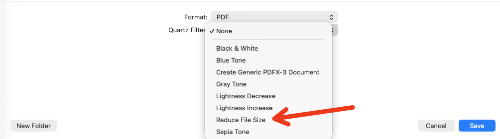
    Go to File → Export and open the Quartz Filter dropdown, then choose Reduce File Size. There’s no preview of how much you’ll save – you just have to save it and check – but it compresses whatever it can without losing the information in the document.

    A screenshot showing where to find the Reduce File Size feature on the Quartz Filter dropdown when exporting a PDF in Preview.

    In one of my own tests, the same document went from 6.1 MB down to 5.3 MB. Not a huge difference, but often it’s enough to get you under a file size limit.

    Fill In a Form and Reply Straight From Email

    If someone emails you a PDF form, you can open it right from Apple Mail, fill it in with Preview, and reply with the completed form attached – without ever saving the file to your desktop.

    When you go to save, Preview asks what you want to do: reply to the original email with the form attached, start a new email, or just save the file. Choose reply and it builds the email for you, with the filled-in form already attached.

    It Does Images, Too

    Most people end up using Preview for opening PDFs but it can do a fair bit with images as well. It’s not going to replace apps like Photoshop or Pixelmator, but for the everyday stuff, it’s more than capable.

    Remove a Background in One Click

    Preview has a background removal tool built right in – it’s the icon beside the rotate button.

    A screenshot showing where to find the Remove Background tool on the Preview toolbar.

    Click it and Preview strips the background out from behind your subject. It won’t be as clean as a dedicated app, and if you zoom in you’ll see it loses some fine detail around the edges. But for something like a profile picture, where the image gets shrunk down anyway, it’s more than good enough.

    The tool is greyed out on some photos where it can’t recognize what’s in the foreground and what’s in the background. If you don’t see it active, the image just isn’t one it can work with.

    Strip Location Data Before You Share a Photo

    This one is more of a privacy tip than an editing trick, but it’s worth knowing.

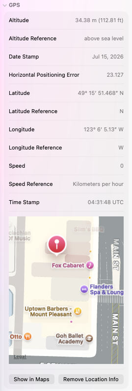
    Most photos from your iPhone (or a digital camera) carry a lot of hidden information – lens details, resolution, and often the exact location where the shot was taken. Click the ‘i’ icon on the toolbar to open the inspector, then look under the info tab for the GPS section and Preview will show you where the photo was taken on a map.

    A screenshot showing example GPS data from a photo in Preview.

    If you’re sending a photo to someone and you’d rather not hand over that information, there’s a button to remove it. Save the edited image and that information is gone.

    The App You Already Paid For

    Preview rarely gets the attention some of Apple’s other apps do. But it’s a genuinely capable tool, it’s built into every Mac, iPhone, and iPad, and it might save you a few bucks on paid apps.

    Apple has a good online manual for it if you want to dig deeper.

    If you’d rather see all of this in action, I walk through it step-by-step in this video:

  • How to Build a Simple Project System in Apple Notes

    Learn how to set up Apple Notes so you can find all the details about your projects quickly and easily.


    Have you ever started a project with the best intentions of keeping your notes, tasks, and other resources organized, but ended up with things scattered all over your system a few days later?

    It’s a struggle to find anything when you need it and you end up wasting time looking for things instead of working on what you need to get done.

    I hate to admit how often this happens to me if I don’t spend a few minutes setting up an organization system before I start.

    And a few minutes is all it takes…

    The “Findability” Problem

    When you first set up your notes system, task manager, and other tools, it’s easy to find everything. If you create a new note or want to pull up your list of tasks for the day, it probably only takes a few seconds.

    But once you have a few projects on the go as well as all the other odds and ends you add to your system, it gets messy fast.

    You end up with random notes floating around and you spend more and more time tracking down the information you need. That’s time you’re not spending working on the project itself.

    There are lots of ways to organize projects but I like Apple Notes for a couple of reasons.

    1. It’s available on all of Apple’s platforms and the syncing is quick and reliable for the most part
    2. Apple Notes has become pretty powerful over the last few years

    Step 1: Create a Project Folder

    The first step is to create a folder for the new project. This is where all the notes related to the project get saved as you capture things.

    Where you put the project folder depends on how you have your notes set up. There are various approaches:

    • PARA — Projects, Areas, Resources, and Archives as the four top-level folders. If you use a system like that, you’d drop the project into the Projects folder.
    • PPV – Pillars, Pipelines, and Vaults as the top-level folders. In this case, projects go in the Pipelines top level folder.
    • By area of life — In my case, I prefer to organize by the area of my life things relate to: personal, business, health, learning, and so on.

    There’s no right or wrong way to do this — it’s whatever you’re most comfortable with and whatever clicks with the way you think. The trick is to set it up so everything is in the place you would expect, even if you come back to it months or years from now.

    Step 2: Create the Hub Note

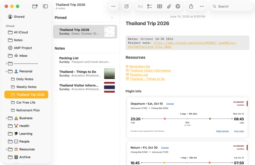
    Once you’ve created the folder, you start creating notes inside it. The first note you create is the hub note. I’ll use a hypothetical trip to Thailand as an example.

    Screenshot of Apple Notes app on the Mac showing an example project note.

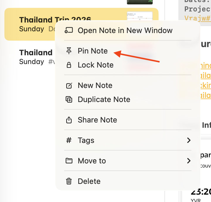
    Next, pin that note to the top so it’s always the first thing you see in the folder. To pin a note, just right-click and choose Pin Note.

    Screenshot of Pin Note option in Apple Notes on the Mac.

    It stays at the top no matter what else you create or edit, so it’s always quick to get into the hub note that links out to everything else.

    Add Your Metadata at the Top

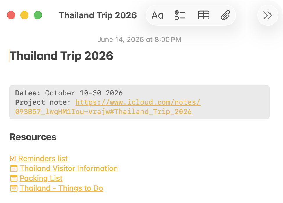
    At the top of the hub note, I put some metadata for the project.

    Screenshot of metadata at the top of the example project note

    In this case it’s a trip, so I’ve got the hypothetical dates. But this could be a due date for the project, or if it were an article I was working on, it might be the publish date.

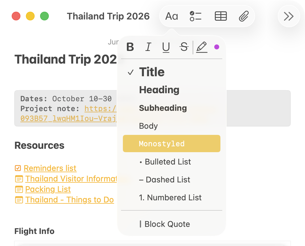
    I like to have it all in the grey box like the screenshot above to help separate it from the rest of the note. To format it that way in Apple Notes, choose the Monostyled text format.

    Screenshot of how to set text to the Monostyled format in Apple Notes on the Mac

    I might want to link to this note from other places, so I add a link to the note itself in this section. The iCloud link is the sharing link for the note. Having it here means it’s handy to copy anywhere else I might want to use it.

    Step 3: Link Out to Other Resources

    Below the metadata I list links to the project’s resources. For example, a Reminders list – clicking it takes me straight to the list related to this trip. At the top of that Reminders list, I also include a link back to the hub note — a quick way to move back and forth between the pieces of the project.

    Screenshot of example project note showing resource links

    I also link to other notes in the project so they’re all easily accessible. In this example, I’ve only got four notes, so it isn’t strictly necessary. But on a bigger project with a long list of notes, having links to the important ones here is easier than having to scroll through the list to find what you’re looking for.

    Separate Notes for Reusable Pieces

    Anything related to the project can go into the hub note. In this example, that could be flight information, Airbnb or hotel info, and so on. But I break some things out into separate notes, mainly because I might want to reuse them later.

    For example, I’ve got a few separate notes for this Thailand trip:

    Screenshot of example project folder in Apple Notes on the Mac
    • Thailand visitor information – this note has details like travel advisories and Thai visa info. If I take another trip to Thailand down the road, this info will be useful again. Instead of burying it in a note tied to this one trip, I keep it separate so I can link to it from whatever new hub note I create.
    • Packing list — the packing list is more or less the same for every trip, so keeping it separate makes it easy to reuse or duplicate for another trip rather than sticking it inside one project’s note.

    Checklists vs To-Do Items

    I have a Reminders list link in the hub note for all the actionable to-do items. But I also keep checklist notes separately, because I treat checklists differently from to-dos.

    • Checklists are reminders to make sure I don’t forget a step — not really things I have to do. I don’t want them cluttering my list of tasks for the day, but I still want to check them off as I go.
    • To-do items in Reminders are actionable tasks – things I have to pick up, things I need to do by a certain date, etc. This is the stuff I actually want to see in Reminders at the start of the day.

    Integration with Other Apple Apps

    One reason I use Apple Notes for this is how well it integrates with other Apple apps. If I get an email with flight itinerary details, I can send it into Notes and have the details right there. If I’m looking at a page in Safari I want to save, I can share it into Notes just as easily. It makes it easy to pull information from other places on my Mac, iPhone, or iPad into these notes and keep a running tab as the project goes on.

    Over time the hub note gradually grows as I work through it. As I add things, anything I think I might want to reuse gets saved into the project folder as a separate note so I can link to it from other places later.

    A Few Minutes Now Will Save You a Lot More Later

    When you start a new project, everything is fresh in your mind, and it’s easy to assume that’ll always be the case. But in my experience it doesn’t take long for things to get disorganized and you forget where things are.

    Taking a few minutes to set up the scaffolding before diving in saves a lot of time and headaches as the work progresses.

    If you want to see how to set this up for yourself, I walk through the process step-by-step in this video:

  • How to Capture Ideas in Apple Notes

    How to customize the shortcuts in my recent Notes Quick Capture video.

    This post has some details about how to customize the Quick Capture shortcuts I went through in my recent video about capturing notes on various Apple devices.

    If you found this without having seen the video, this is the one:

    Shortcut Links

    Note: I didn’t mention it in the video but the Action Button shortcut can be run from anywhere. It doesn’t have to be connected to the action button on newer iPhones. You could add the shortcut to your home screen, use a Shortcuts widget, or any other option for running a shortcut. It also works on macOS and iPadOS, not just iOS.

    Customizing the Quick Capture Menu

    There are several options you can customize with the action button menu shortcut.

    Date & Time Formats

    I’m using YYYY-MM-DD for the name on my daily notes. I prefer that format because it sorts into a more logical order (grouped by years and months) as more notes get added.

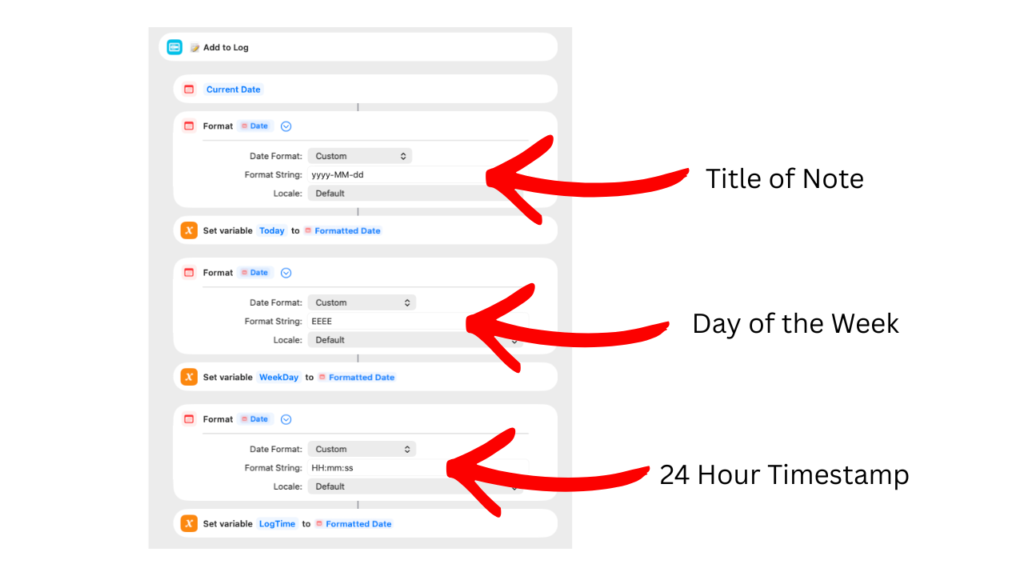
    If you prefer a different naming scheme, you can adjust it in the first “Format Date” action in the shortcut:

    You can adjust it in the Format String field. In this example, it’s set to yyyy-MM-dd which translates to a date like 2026-02-09. There are lots of different options to format the date though.

    You’ll find details in the Shortcuts manual and a more complete list on the Unicode #35 standard page.

    Make sure you use a format that will create a unique note every day. For example, if you only used MM-dd you would start getting duplicate titles after the first year of daily notes. If you have more than one note with the same name, the daily log action could have problems and log to the wrong note.

    The second and third Format Date actions can also be changed if you prefer something different. They’re using format strings based on the information at those links.

    EEEE = full name of day (eg. Monday)
    HH:mm:ss = 24 hour time reference (eg. 15:33:12)

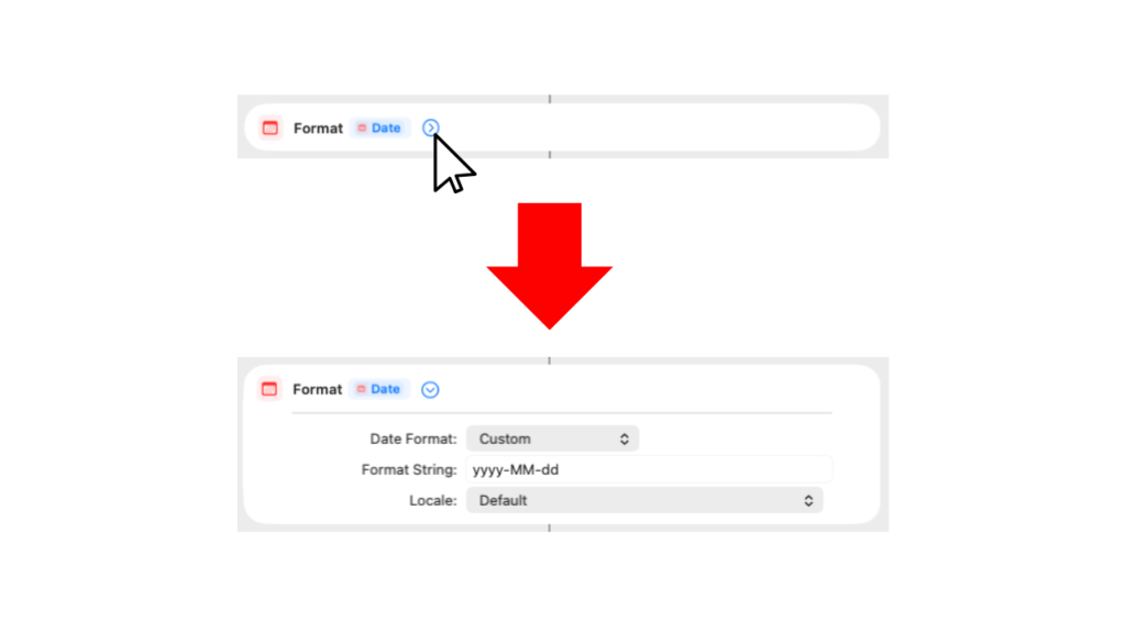
    If you don’t see the Format String details after installing the shortcut, click the disclosure arrow to the right of the “Format Date” heading to expand that action.

    Note Links

    The name of the note used in the Daily Log section of the shortcut is based on the date format you’re using for the name of your daily notes. If you change the date format, it will automatically look for a matching note.

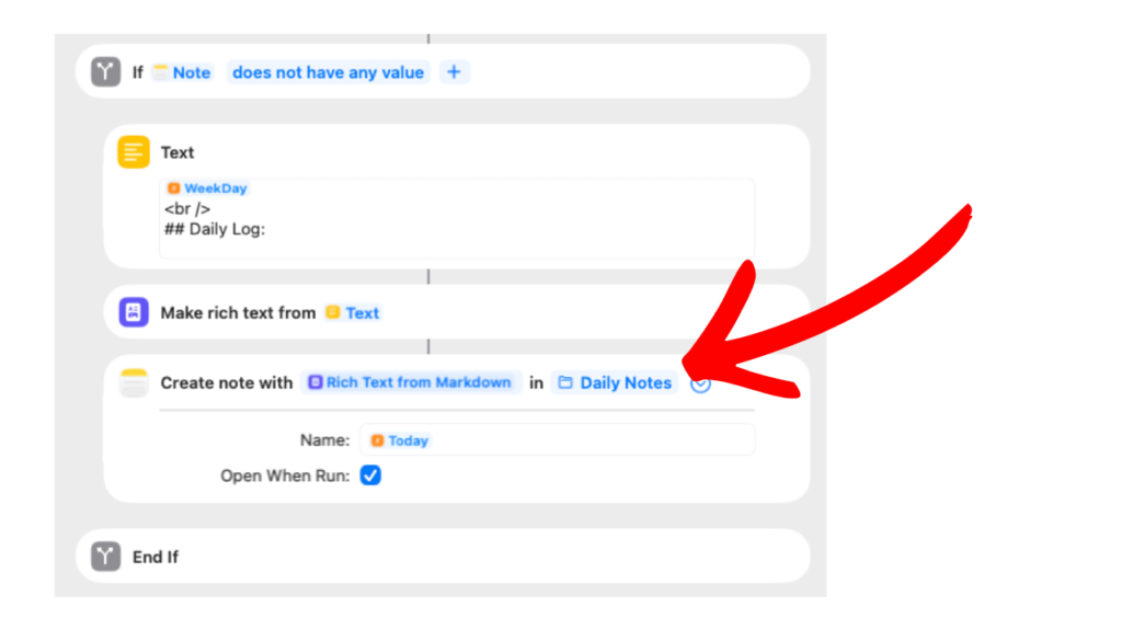
    You’ll need to make sure the daily notes folder is set up to match your folder structure though. It’s set in the “Create Note” action:

    Click the “Daily Notes” link after Create note with Rich Text from Markdown to choose the correct folder for your notes.

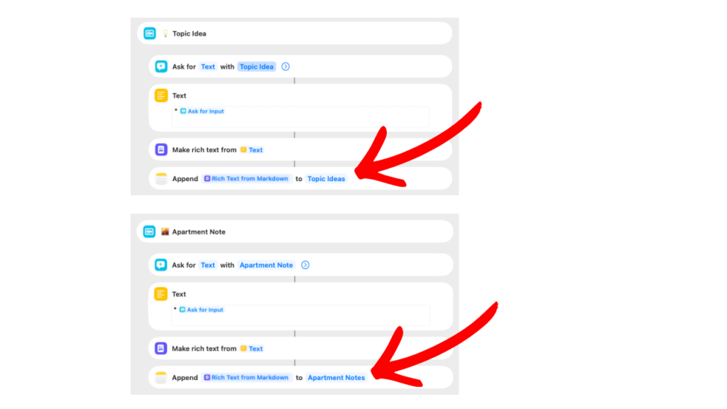
    The other two examples (Topic Ideas and Apartment Ideas) point to specific notes in my Notes app. You can change those to link to whatever note you want to use by clicking on the name of the note in the Create note with Rich Text from Markdown action.